Most websites are built to be seen. Adaptive websites are built to respond. That distinction — subtle on the surface, significant in practice — is quickly becoming the line between B2B digital experiences that convert and ones that merely exist. For CTOs, marketing directors, and agency leaders evaluating their next web investment, understanding what adaptive websites actually do, and why they matter more than ever, is no longer optional homework. It’s strategy.
Most websites are built to be seen. Adaptive websites are built to respond.
What Makes a Website Truly Adaptive?
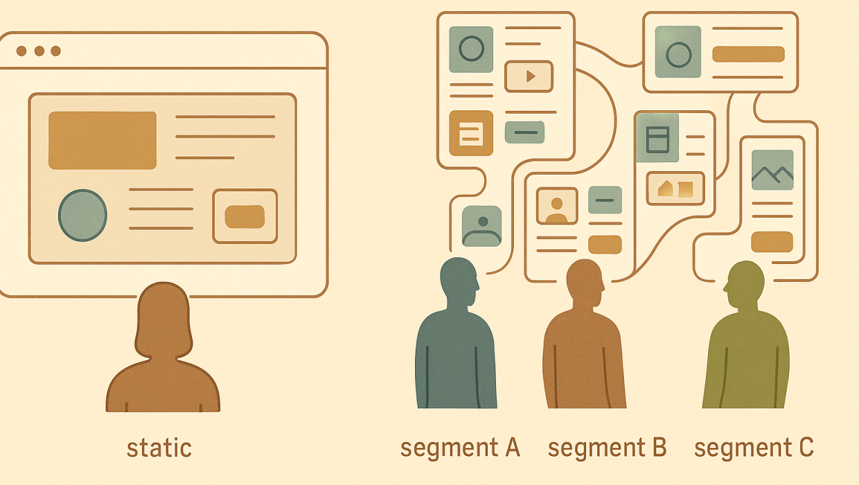
An adaptive website doesn’t just resize itself for a phone or a tablet. It changes what it shows, how it behaves, and sometimes even what it says, based on who’s looking at it and what they need. A returning enterprise buyer might see a different homepage module than a first-time visitor from a paid search campaign. A user browsing from a mobile device on a slow connection might get a leaner build with prioritized content, while a desktop user gets the full interactive experience.
This is a meaningfully different proposition from simple responsive design, which — while essential — is primarily concerned with layout: making sure a grid doesn’t break when the viewport shrinks. Adaptive design assumes the layout question is solved and asks a harder one: what does this specific visitor actually need right now, and how do we deliver it without friction?
Beyond Responsive: Why Adaptive Web Design Goes Further
Responsive web development remains the foundation — no adaptive site works without a solid responsive base underneath it. But responsive alone treats every visitor identically once screen size is accounted for. Adaptive web design layers behavioral logic, contextual data, and dynamic content on top of that foundation, so the experience flexes not just to device, but to intent, history, and context. Think of responsive as the skeleton and adaptive as the nervous system.
The Business Case for Adaptive Websites in B2B
B2B buying journeys are long, multi-threaded, and rarely linear. A single deal might involve a technical evaluator, a budget holder, and an end user, each hitting your site at a different stage with a different question. A static site forces all three into the same generic funnel. An adaptive site can recognize signals — referral source, past behavior, firmographic data, even time of day — and adjust content accordingly.
The payoff shows up in measurable places: lower bounce rates on landing pages, higher engagement with product pages, shorter sales cycles because prospects arrive better informed, and improved lead quality because forms and CTAs are tuned to where someone actually is in their journey rather than a one-size-fits-all approach. We’ve seen this play out directly in client work — the kind of outcome detailed in our case studies, where structural changes to how a site behaves, not just how it looks, moved the needle on pipeline metrics that marketing and sales teams both care about.
Diagnosis Before Build: How We Approach Adaptive Web Design
It’s tempting to treat adaptive functionality as a feature you bolt onto an existing site — a personalization plugin here, a chatbot there. That approach almost always underperforms, because adaptive experiences only work when they’re built on an accurate understanding of who your actual users are and what they’re trying to accomplish.
This is why any serious adaptive web project should start with diagnosis, not design. Before a single wireframe gets drawn, the right questions are: What are the three or four distinct visitor segments that matter to this business? What decisions are they trying to make when they land on the site? Where does the current experience — if one exists — fail them? Skipping this step and jumping straight to build tends to produce sites that are technically dynamic but strategically directionless, full of clever features nobody asked for.
Mapping User Journeys Before Writing Code
Concretely, this means building journey maps for each key segment, auditing existing analytics for drop-off points, and interviewing sales or customer success teams about the questions prospects ask most often. Only once that picture is clear does it make sense to define what “adaptive” should actually mean for a given site — which content should shift, which shouldn’t, and where personalization adds genuine value versus where it just adds complexity. Our web development team treats this diagnostic phase as non-negotiable, precisely because it determines whether the eventual build solves a real problem or just looks impressive in a demo.
Dynamic Content: The Engine Behind Adaptive Experiences
Dynamic content is the mechanism that makes adaptive websites function. Rather than serving a fixed HTML page to every visitor, an adaptive site pulls from content management systems, customer data platforms, or behavioral tracking tools to assemble a page in real time. This might look like:
A homepage hero that changes based on the visitor’s industry, detected through IP-based firmographic lookup. A resource section that reorders itself based on what content type a returning visitor has engaged with previously. Pricing or case study modules that surface different proof points depending on company size signals. Chat or CTA prompts that shift tone and urgency based on how far a visitor has scrolled or how long they’ve stayed.
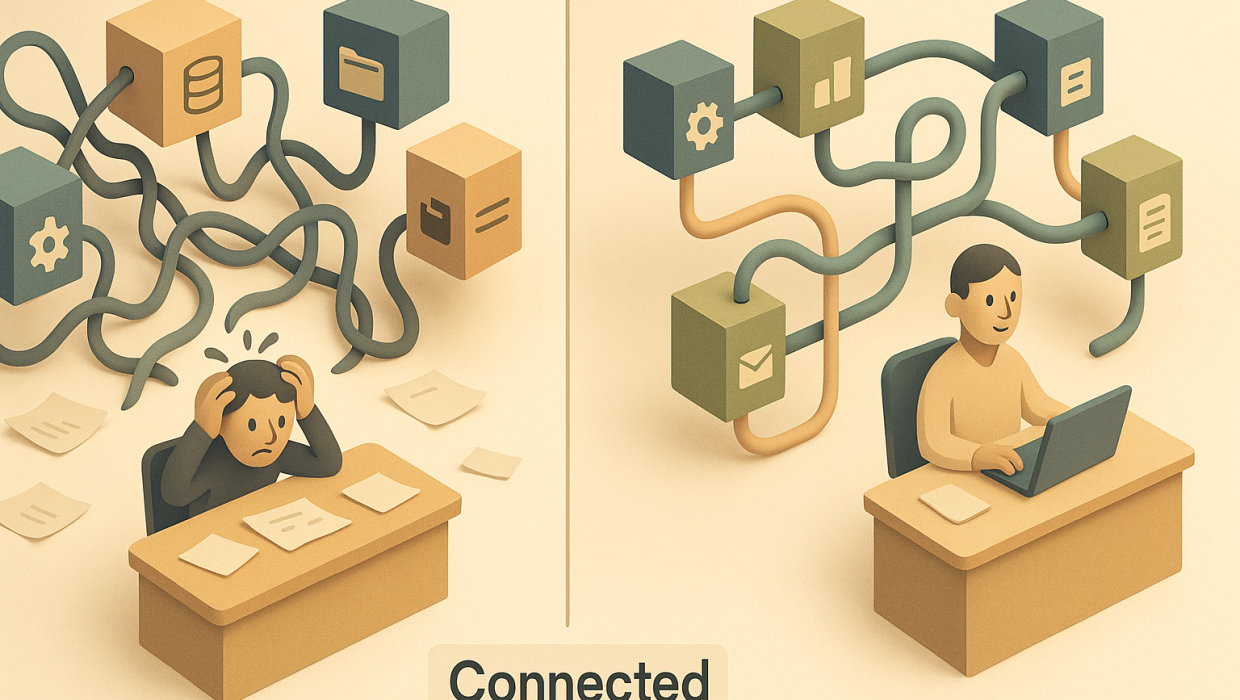
None of this requires guesswork or gimmicks — it requires clean data plumbing, a content architecture flexible enough to support variation, and clear rules about what triggers what. When those pieces are missing, “dynamic content” becomes a euphemism for a cluttered, inconsistent site that confuses more than it converts.
Technical Foundations of Responsive Web Development
Adaptive functionality is only as good as the responsive web development underneath it. If your core templates, grid systems, and component libraries aren’t built to flex cleanly across breakpoints, any adaptive logic layered on top will inherit those weaknesses and often amplify them. A dynamically inserted module that looks fine on desktop but breaks a mobile layout doesn’t feel adaptive — it feels broken.
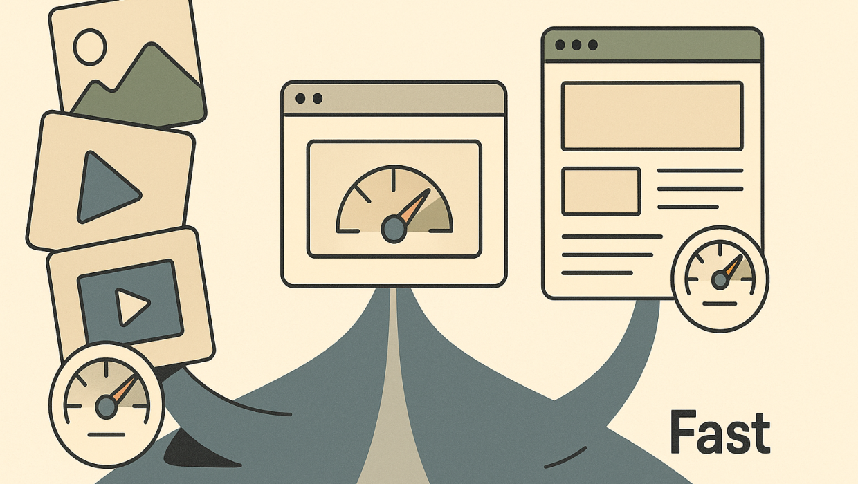
This is also where performance discipline matters most. Every additional data call, personalization script, or content variant adds weight and latency. A genuinely adaptive site has to balance sophistication with speed, because a slow page defeats the entire purpose of tailoring an experience — nobody sticks around long enough to benefit from the personalization if the page takes six seconds to load. Getting this balance right is technical work, not just design work, which is why it belongs with a team that treats web design and development as engineering discipline rather than decoration.
Common Pitfalls When Building Adaptive Websites
A few patterns show up repeatedly in adaptive projects that underdeliver. The first is over-segmentation — trying to personalize for a dozen micro-audiences when three or four meaningful segments would capture 90% of the value, resulting in a maintenance burden nobody can sustain. The second is treating adaptive design as a one-time build rather than an ongoing discipline; content rules and personalization logic need regular review as buyer behavior shifts. The third, and most common, is skipping measurement — deploying dynamic content without a clear way to track whether it’s actually improving outcomes versus just adding complexity.
A fourth pitfall worth naming directly: bolting AI-driven personalization onto a site before the underlying data and content architecture can support it. Predictive content and behavioral triggers can be genuinely powerful, but they depend on clean inputs. Pairing thoughtful automation and intelligence with a site architecture that’s actually ready for it changes everything — pairing it with a shaky foundation just creates a more sophisticated version of the same problem.
What Adaptive Websites Mean for Your Bottom Line
For B2B decision-makers, the case for adaptive websites isn’t aesthetic — it’s operational. A site that adjusts to visitor intent shortens the distance between someone landing on a page and that person understanding whether you’re the right partner. It reduces the burden on your sales team to re-explain things your website should have already clarified. And it creates a feedback loop: the more data your adaptive site gathers about what resonates, the sharper your marketing and content strategy can become across every other channel.
None of this happens by accident, and it rarely happens by simply layering new tools onto an old site. It happens through deliberate architecture decisions made early, informed by real user data and business goals rather than trend-chasing. If you’re weighing whether your current site can support this kind of evolution, or whether it needs a more fundamental rebuild, that’s exactly the kind of question worth talking through before committing budget either way — you can start a conversation with our team to get a clearer read on where your site stands.
Building for What’s Next
Web technology moves quickly, and the tools available for building adaptive experiences — headless CMS platforms, edge computing for faster personalization delivery, AI-driven content engines — are evolving even faster. Staying current on what’s technically possible, explored further on our technology page, matters less than staying disciplined about why you’re adopting any of it. The goal was never to make a website that does more things. It’s to make one that does the right things, for the right person, at the right moment — which is, ultimately, what good user experience has always meant. Adaptive websites just give us better tools to deliver on that promise consistently, at scale, without asking every visitor to do the work of finding what they need themselves.
RELATED QUESTIONS
What is the difference between responsive and adaptive websites?
Responsive web development adjusts a site’s layout to fit different screen sizes, so a page looks correct on mobile, tablet, or desktop. Adaptive websites go further by changing content, messaging, or functionality based on who the visitor is and what they need, using behavioral data and context rather than just device dimensions.
Why do B2B companies need adaptive websites?
B2B buying journeys typically involve multiple stakeholders arriving at different stages with different questions, and a static site treats them all identically. Adaptive websites adjust content and calls-to-action based on visitor signals like referral source or company type, which shortens sales cycles and improves lead quality.
How does dynamic content work on a website?
Dynamic content pulls from a content management system, customer data platform, or behavioral tracking tool to assemble a page in real time rather than serving the same fixed page to everyone. This allows elements like headlines, case studies, or pricing modules to change based on visitor industry, history, or engagement patterns.
What should a business do before building an adaptive website?
Before any design or development work begins, a business should identify its key visitor segments, map what those segments are trying to accomplish, and audit existing analytics to find where the current experience fails them. Skipping this diagnostic step often results in sites that are technically dynamic but don’t solve any real user problem.
Can adaptive website features slow down page load times?
Yes, if not implemented carefully, since every personalization script or dynamic content call adds processing weight and latency. A well-built adaptive site balances sophistication with speed, because slow-loading pages undermine the entire purpose of tailoring content to a specific visitor.
Ready to Build a Website That Adapts to Your Buyers?
Start a conversation with Sapiens + Machines to discuss your goals, challenges, and next steps.